


Designing a book you would want on your shelf
"A book in posession of a good interior, must be in want of a beautiful cover."

Thanks for reading the 67th edition of my newsletter. This newsletter tracks my work on lumbar nerve root syndromes aka sciatica.
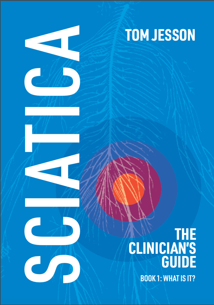
Here’s the cover, if you can ever call it that, for the first version of my book on sciatica:

To be honest, I’m pretty pleased it’s this boring. I could have spend weeks and months faffing with it, and with the contents too, but something told me I just needed to get it out there in the world.
Now though, I have spend a lot of time faffing with fastidiously improving the contents - every illustration, practically every sentence, all with Annina’s help - and turning it into a paperback, too… so it needs a beautiful cover. How to make one?
I start by hiring a designer on a website called Reedsy. I send the designer a brief. I try to explain that although the book is rigorously scientific, it is pretty informal and definitely not a textbook. (I end up giving what is probably a nightmare brief, to be honest. A lot of “it’s X, but it’s also, like… the opposite of X”. For example, “it’s serious and authoritative, but also fun and friendly.”)
I also gave her a few illustrations she might like to use, like this one:

A couple of weeks later, she sends me some first ideas:


Not bad! Professional looking. But they also feel bit too cold and clinical to me. They look like the covers of a book that’s going to hold the reader at arm’s length. And also, none of them really visually represent sciatica.
But I decide to go with it and ask her to make a few changes - can we see the whole figure rather than a close up? Can we highlight the affected nerves? etc. - and a couple more weeks later she sends me this:

Now, the visuals feel a bit more sciatica-y. It’s definitely good enough.
But the yellow highlighted nerve looks wispy and insubstantial. And I don’t love that blue. And once someone points out that the dartboard/target looking thing looks exactly the same as the neurofen logo, I can’t unsee that. So on the whole I’m not that excited about it….
Nevertheless, it is still good enough, and I have already peppered the designer with finicky requests for this change and that change, so I settle with what we have.
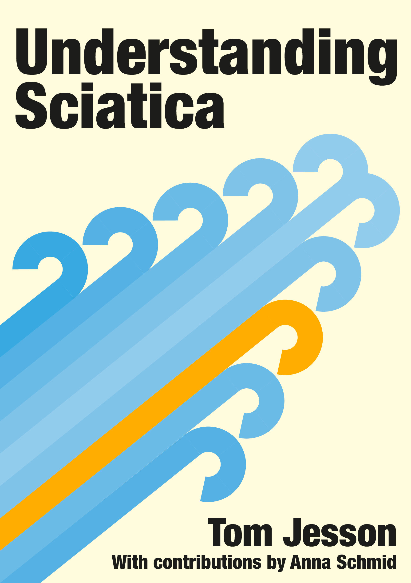
A year or so passes and the re-write is finally finished (the book has also been re-named). I go back to that design, and I still feel kind of deflated about it. I want the cover to just be a bit cooler. So I try to make my own…
I stick with that interesting old-fashioned image of the nervous system, and play around on Canva…
I manage to make something that is visually striking, and looks serious but also singular and characterful:

But it’s clearly made by an amateur, and I try as I might I can’t make it look any more professional. Plus, when I ask on twitter, a lot of people really hate it, saying it reminds them of fusty old uni textbooks (it’s meant to be retro, but apparently it’s too retro). Some people even DM to try to persuade me that it’s not good enough for the book!
Okay, okay. Forget designing it myself.
So, as if I am made of money, I simply hire another designer and start again.
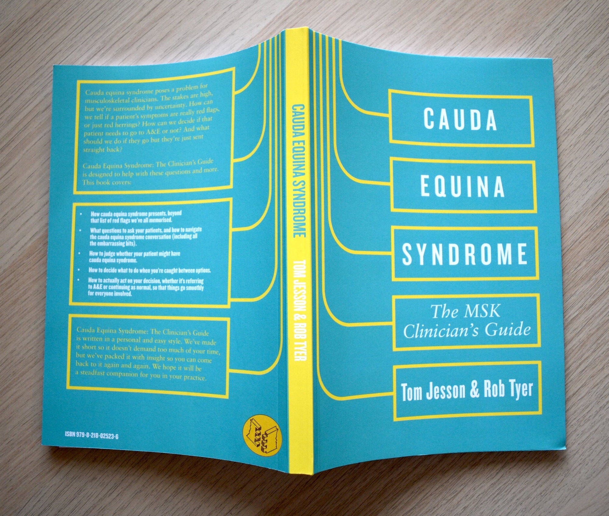
I re-hire the designer who made the beautiful cover for Cauda Equina Syndrome: The MSK Clinician’s Guide - a process that went very smoothly.
I make the brief a bit less self-contradictory, and give the designer four or five very specific ideas (along the way I have learned that they don’t seem to actually want a blank slate, but would rather be pointed in a clear direction).
One of the ideas, which is what the designer decides to run with, is that we should flip this old modernist poster upside down, making it look like a cauda equina, and single out one of the roots somehow to imply it’s the ‘sciatica root’.

Here’s what the designer sends me:
Now already, this actually looks like a book one might like to read, so I’m happy. But the cauda equina is off at an odd angle (when would it ever be like that physiologically - during a handstand?) and the colour blue makes it look like a fountain. (Also… Annina’s name is wrong!)
I send back some notes and a few weeks later he sends back these:
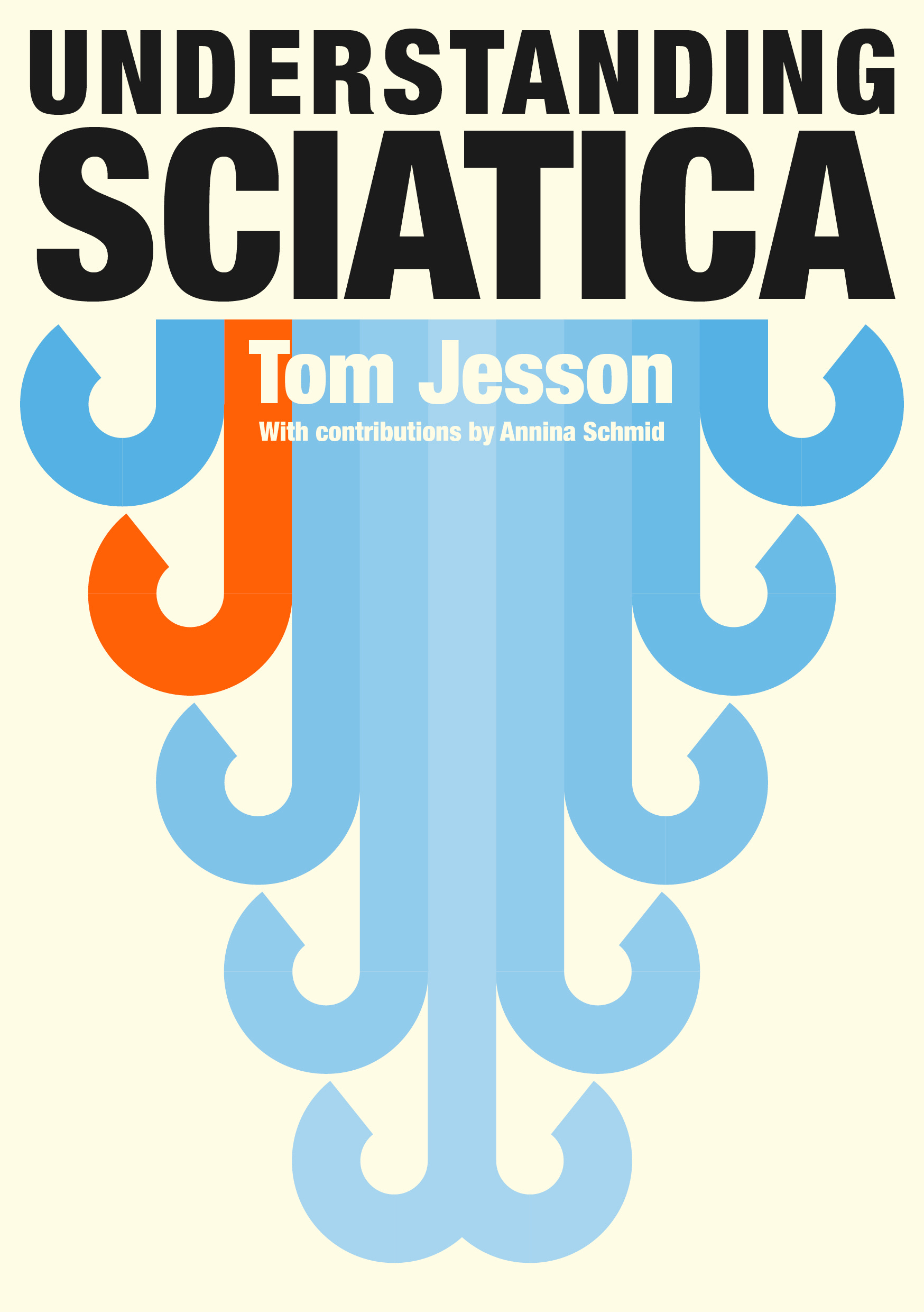
Bold and beautiful! But still not quite right. The multi-coloured ones are great to look at, but it’s not obvious which root is ‘the one with sciatica’, so the whole visual metaphor is diluted. And I still don’t like that watery blue in the other one1.
But if we can fix the colours, we’ll be there. Rather than have a long back and forth with him about the endless colour combinations he could show me, I decide to do this myself. I like this green one until someone points out it looks like a Christmas tree:

Maybe this yellow one? But it looks a bit washed out…

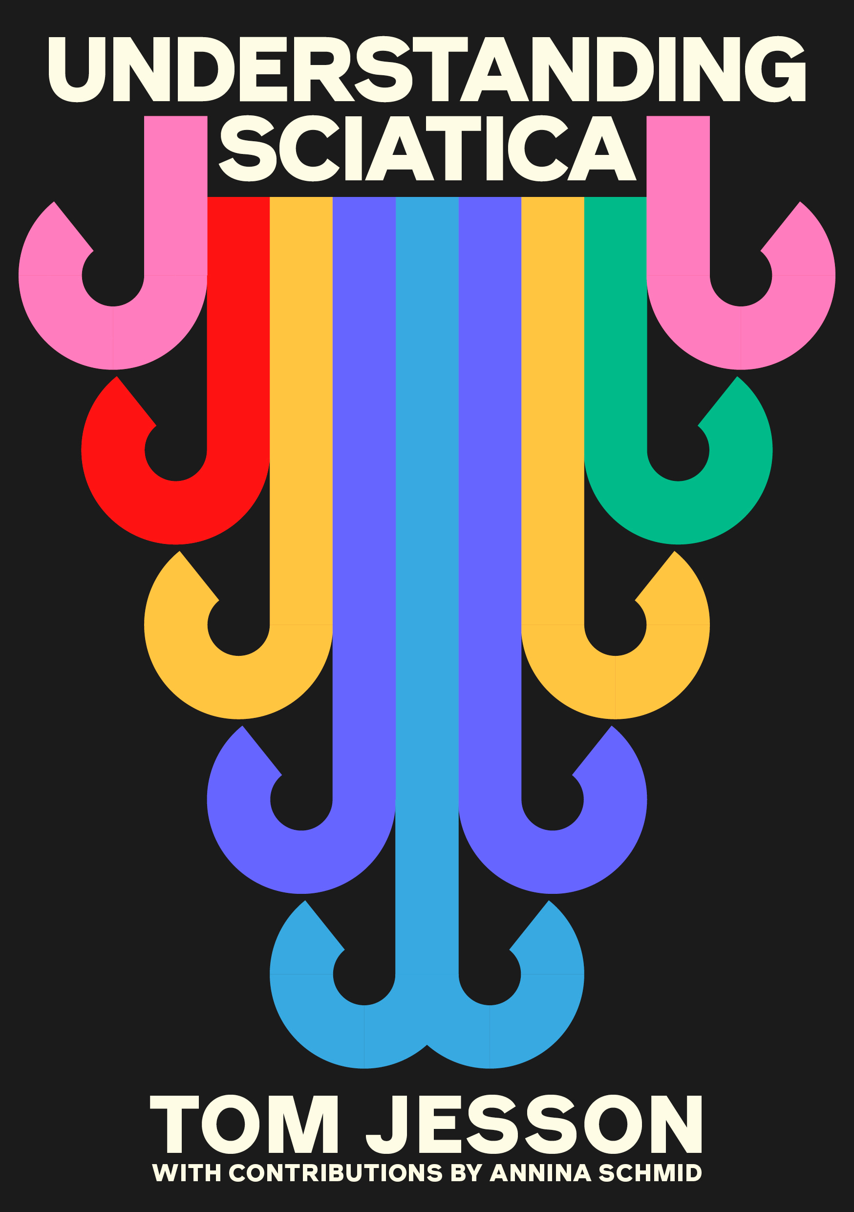
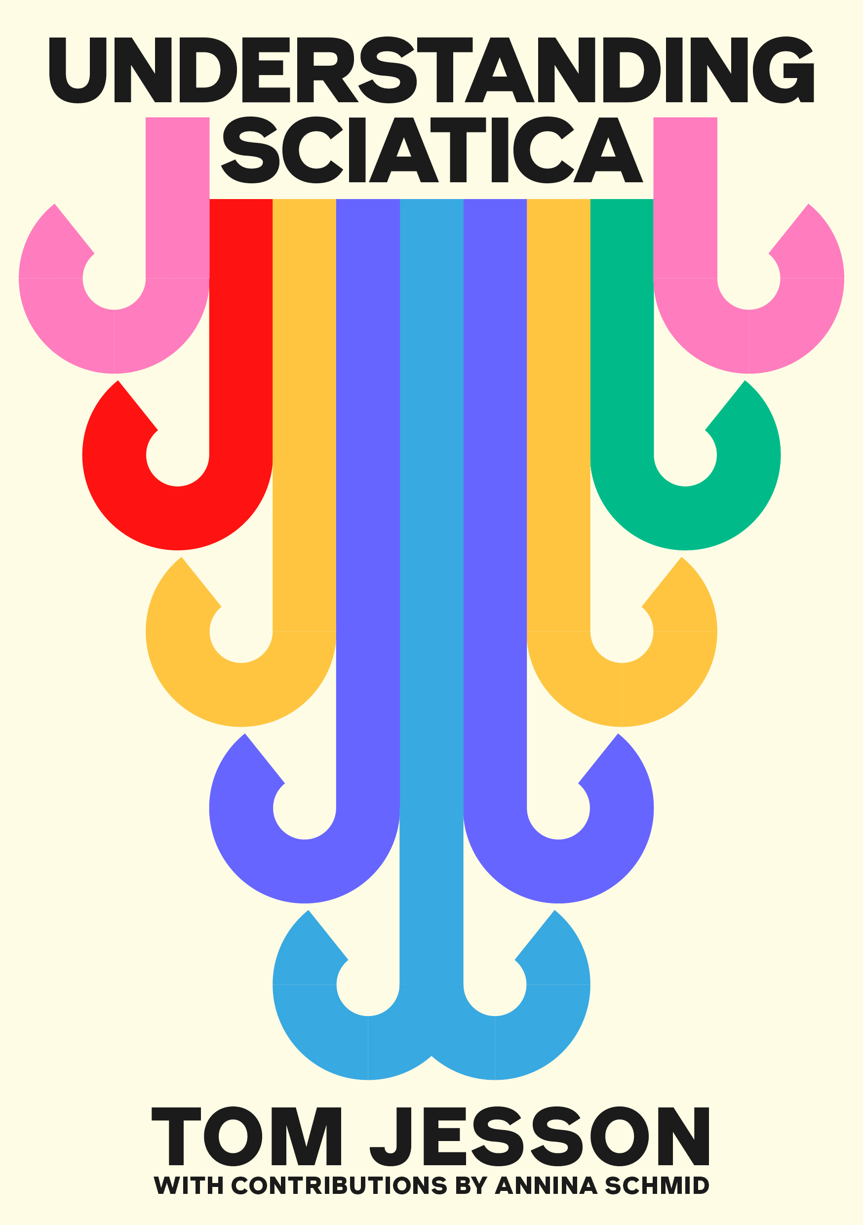
Then, I think to change the background so it matches the background of the CES book…

And… that’s it! This, I like… I think it’s the first one in all this time I’ve actually liked looking at2. I haven’t tested it on twitter yet, partly because if people don’t like it I don’t have the heart (or cash) to start again, but mainly because even if a lot of people do dislike it, I don’t think I can be persuaded away from it. It’s memorable, bold and, if it’s to your taste, beautiful, without giving up any professional gravitas. And most of all, it clearly communicates that the book will not be boring.
So there you have it. Front cover done. Now i’m just waiting for the spine and back cover than then finally, at long last… it will exist in the real world.
Til next time,
Tom
P.S. I have chatted to a few people privately about the process of independently publishing a book - get in touch if you want to do the same.
Another problem is that the roots curl up at the ends, which they don’t in real life. I mention this but the designer persuades me that it would look much worse if they didn’t, so I agree to chalk it up as artistic licence.
The only thing I’m not sure about - the lettering is in off-white, I think? Will probably change that.
Love the design of the cover! Thanks for sharing the design process and the thoughts behind it :) I agree the cover is important and it's what sometimes makes you want to read or not to read a book. So well done!
I'll buy the paperback when it comes out--no matter what the cover looks like!